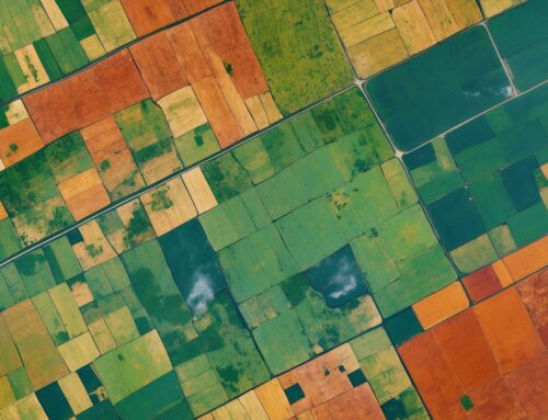
The satellite map view on the farm management dashboard is an essential feature for farmers who want to manage irrigation and understand soil moisture conditions across their fields. By combining real-time sensor data with an interactive map, this tool offers an easy and visual way to assess soil health and optimize watering schedules. Let’s take a closer look at how the satellite map view is organized, what it displays, and how it empowers farmers to make data-driven decisions.
Visualizing Soil Moisture Levels with a Heatmap Overlay
The satellite map features a heatmap overlay that displays the soil moisture levels recorded by each sensor on the farm. The heatmap provides a quick and intuitive overview, with each sensor reading color-coded to represent its current status:
- Blue: Overwatering or saturation
- Green: Appropriate moisture level
- Yellow: Underwatering, approaching wilting point
- Red: Low water levels, at or near wilting point
These color codes make it easy for farmers to identify areas where water management needs to be adjusted. By simply glancing at the map, farmers can tell which parts of the field are adequately watered, where they need to increase irrigation, and where water may be pooling excessively. This feature not only saves time but also helps reduce the risks of overwatering or underwatering, ultimately promoting better crop health.
Interactive Map Features for Informed Decision-Making
The satellite map view is more than just a visual representation—it is an interactive tool designed to enhance farm management. Farmers can zoom in and out to focus on specific areas of the field, providing either a detailed or broader view of their farm’s soil moisture levels. By clicking on any sensor, the corresponding sensor will be highlighted in the dashboard’s sensor table, which allows farmers to take further action.
Once a sensor is highlighted, the farmer can choose to enable or disable it, making it easy to manage active sensors based on operational needs. The map also allows for fine-tuning the soil type linked to each sensor, providing flexibility as conditions change. The soil type can even be customized using Terrestream’s soil calibration services, ensuring that the sensor data remains accurate and reliable.
Looking Back in Time and Predicting the Future
One of the key strengths of the satellite map view is its ability to provide both historical and predictive insights. Farmers can cycle backward in time to see how soil moisture levels changed on previous days. This helps them understand the impact of their irrigation decisions and any external factors, such as recent rainfall, on soil moisture conditions. By reviewing this historical data, farmers can refine their strategies for better irrigation management.
Moreover, the map view allows farmers to forecast future soil moisture levels by integrating predictive analytics. These forecasts are generated using historical data, weather forecasts, and climate models, giving farmers a proactive tool to anticipate and address changes in soil moisture. This level of foresight means that farmers can be better prepared for upcoming dry spells or adjust watering schedules if significant rainfall is predicted.
Why the Satellite Map is an Effective Way to Visualize Data
The satellite map view is an effective way to visualize soil moisture data because it combines geographic context with real-time sensor readings. This combination provides a holistic understanding of how moisture levels vary across the farm. By using a color-coded heatmap, farmers can easily identify problem areas without needing to analyze complex numerical data. The visual representation simplifies the decision-making process, making it easier for farmers to take immediate, targeted actions.
Furthermore, the interactive nature of the map—allowing for zooming, clicking on sensors, and adjusting parameters—enables farmers to engage directly with their data. This hands-on approach not only improves understanding but also fosters a deeper connection between the farmer and the farm’s health. By making data visualization both accessible and actionable, the satellite map view ensures that farmers can make the best possible decisions for their fields.
A User-Friendly, Actionable Tool for Modern Farming
The satellite map view is designed to make soil moisture data actionable and easy to understand. By offering a comprehensive visual representation of the farm, along with interactive features that allow for sensor adjustments and soil type calibration, the map empowers farmers to make precise and data-driven decisions. The ability to analyze both historical trends and predictive forecasts sets the satellite map apart as a valuable asset for optimizing irrigation and enhancing overall farm health.
With this powerful visualization tool, farmers can ensure that every area of their farm is receiving the right amount of water, maximizing crop productivity and minimizing water waste. The satellite map view is a testament to the importance of leveraging technology to bring clarity and efficiency to farm management.

